Bol.com - Orders Overview
At Bol.com I was responsible for our partners' UX of the (B2B) Seller Portal. I supported different teams by advising stakeholders, delivering UI Designs and Interactive prototypes, and conducting User research.
From partner services we received quite a few complaints about the order overview. The business had some ideas as well to implement. Based on partner interviews I validated ideas to solve both user problems and business ideas.
My Role
As the UX designer I primarily worked on Interaction and UI design, on the user testing, and user interviews.
Goal
To solve reported problems and add wanted functionality:
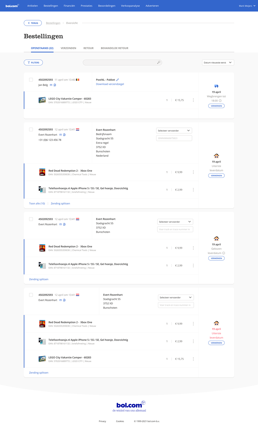
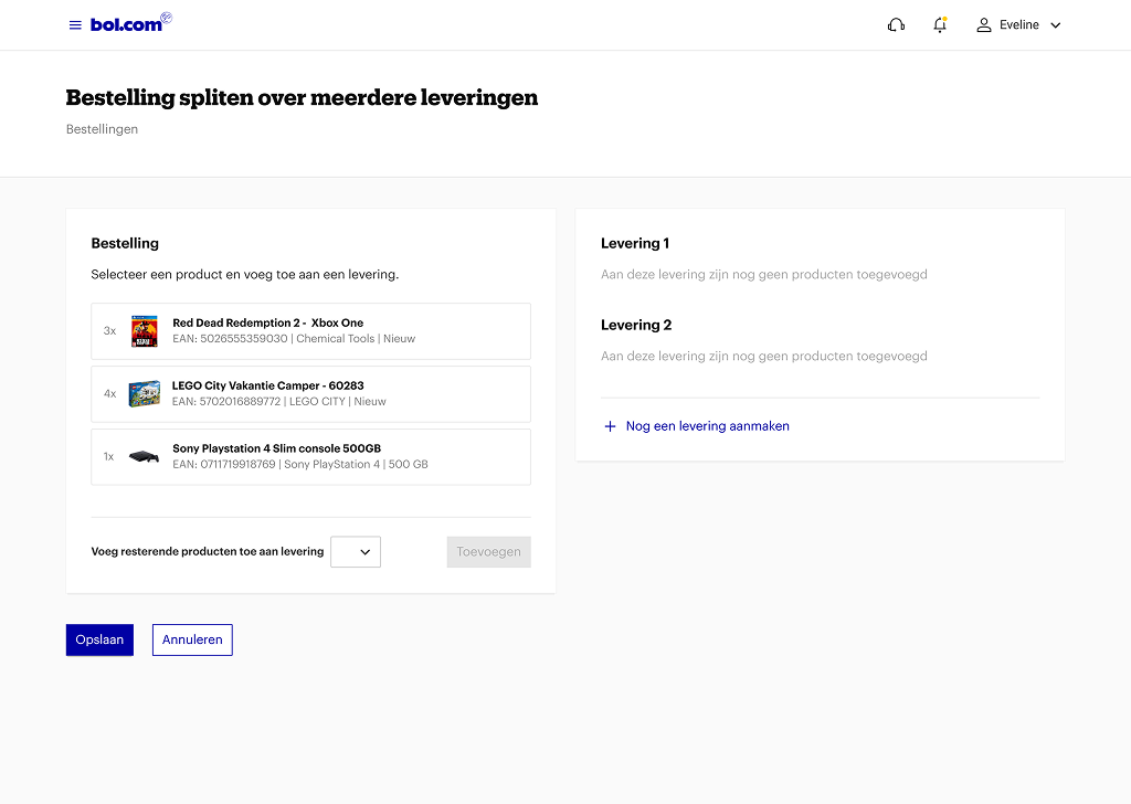
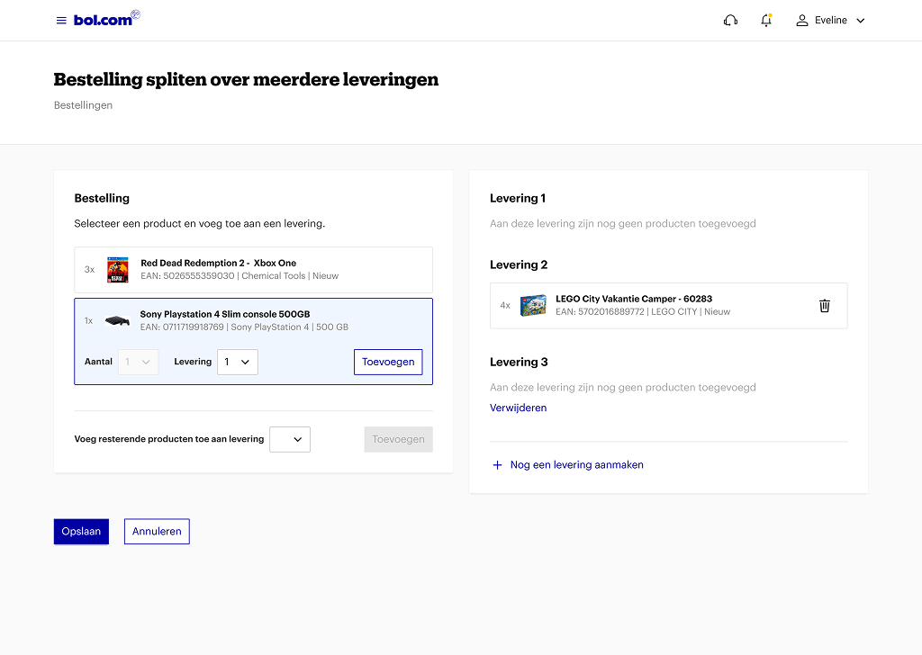
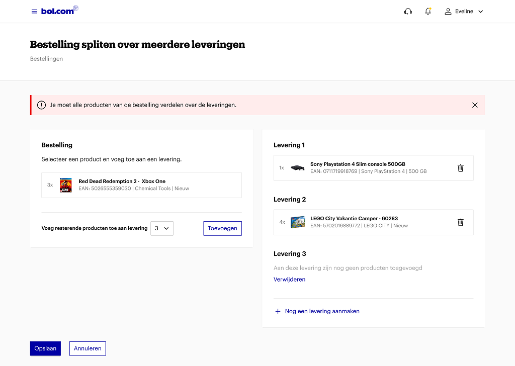
- Partners wanted to be able to split up orders in multiple shipments.
- Long addresses did not fit, resulting in faulty shipping labels.
- Input fields were too small for certain tracking numbers.
- Partners don't understand what the icons mean, resulting in delayed shipments.
To validate suggested business idea's and questions:
- Should we define a default shipping method?
- Should we send notifications to partners that don't log in that often?
- Should we notify the partner if an order can't be delivered on time?
- Should we make the overview Mobile?
- Should we create a picklist for the partners?
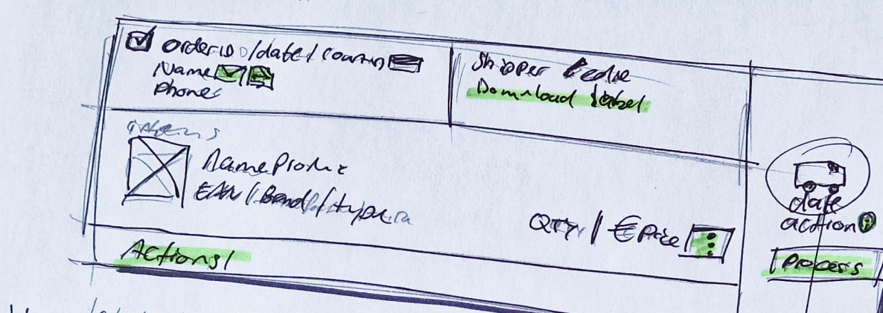
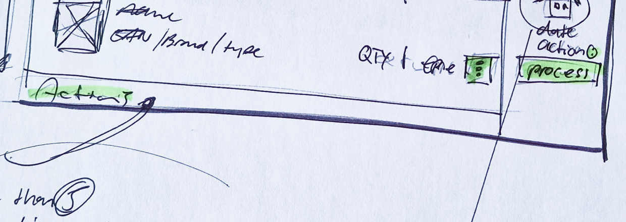
Design process
Data and insights: Gather information from Business Analysts regarding devices used by partners and validate with partner services how often certain problems were mentioned to validate assumptions.
User interviews: Learn how users are currently using the Orders page. Define friction and restriction.
Ideation and validation: Design and create mock-ups and test with users to gather feedback.
UI design: Create responsive and detailed designs for the development team.
Topic research
How do partners currently use the Orders overview page and discover wants and needs.
- How do they process orders?
- How often do they log in tp process orders?
- Would a picklist benefit?
- How do they define a shipping method? By value, country or size?
- Would they benefit from filters? If so, from what?
- Would they benefit from a Mobile version?
Scope
Partners who ship with their own or Bol.com's shipping labels.
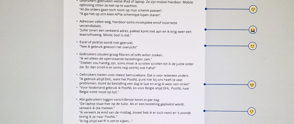
Findings
Users mainly use an iPad or laptop. This makes them mobile. They aren't waiting for a mobile solution.
They don't care for picklist, they just use the overview.
Filters would make their lives easier. Because they only want to see 'open' orders.
Shipping method is completely random. All depends on personal preferences, experiences, and situation.
Most users use webmail, a 'copy email address' functionality would be appreciated.
All kinds of icons without labels makes it hard to scan, filter, and understand.
Design principles
Clarity: The design should communicate its purpose immediately and effectively. Users should understand the function of elements without confusion.
Simplicity: Unnecessary complexity should be avoided. A minimal, focused approach helps users achieve their goals efficiently.
Feedback: The design should provide immediate and clear responses to user actions to confirm interactions and prevent confusion.
Performance-Oriented: The design should be fast and responsive, avoiding unnecessary delays that frustrate users.
Results
Users are able to split up orders and user the Orders overview more efficiently with error prevention. Business ideas and assumptions were confirmed and/or refuted.
- No need to develop a Mobile version.
- No need to develop a picklist.
- No need to develop a default shipping method.
- No need to send notifications to users about orders.
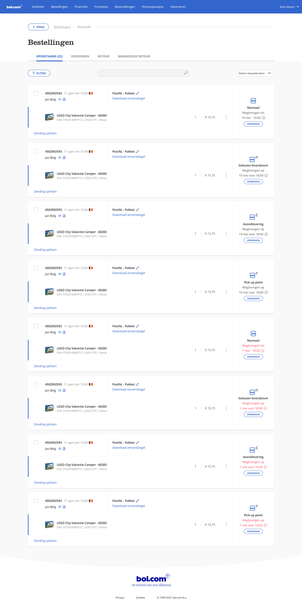
- Long address now fit.
- Filters and a searchbar were added.
- Copy email address functionality added.
- Reduce the amount of icon types, add labels, and warnings.
- Improving the overall user experience.